Sufjan Stevens – The BQE
I totally admire creative people working in all manner of fields all at once, and Sufjan is a prime example. The typography throughout the whole release (hyped on the sticker that was on the front as “illegible graffiti”) is jaw-droppingly awesome. The combination of blocky 8-bit outlines with crazy perspectives, smooth fades and no shortage of fluoro ink, make just reading it an adventure. Superimpose that on a bunch of dilapidated expressway snaps, then throw in a bunch of hula-hoop girls dressed as superheroes and you really can’t go wrong.
Bogulta – A Happy New Anarchy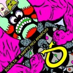
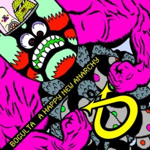
Bogulta are an integral part of the Osaka underground, and their music is some amazing death metal/rave/cartoon/prog-rock hybrid. They are, hands down, the best live band I’ve ever seen. I can’t believe they aren’t hugely famous. The artwork is by the bass player, Shogo Yoshikawa, who is also a painter, designer and animator. They are part of this extreme gabba/noise music scene where the designs, posters, gig decor and vibe are cute, bright and happy, which is so cool after seeing similar scenes in other places being dark, angry, evil affairs. You’ve gotta check out Bogulta’s MySpace, there’s links to their amazing manga style film clips, also done by Shogo.
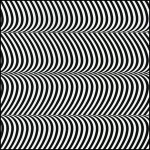
For me, this design by Colour Climax is a great example of a cover capturing the essence of the music. The combination of the op-art design and holographic silver cardboard makes the artwork pulse right in front of your eyes. This makes total sense once you put the record on. It’s full onslaught, white noise that swirls, beats and grates from start to finish. I used to work as rock n’ roll high school teacher, this was the album I would always put on to explain that there are no set rules when making music, just go for it!
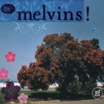
Mackie Osborne is the wife of Buzz, the singer/guitarist of the Melvins, and has done all their artwork for the last decade or so. Her style totally sums up the music, they’re a heavy metal band that aren’t caught up in the tough guy posturing and angriness that usually goes hand in hand with the genre. Her collages of old photos, 50s Americana, random cute stuff and general positivity are always amazing. She also often uses the back side of the CD jewel case as the front cover album artwork, getting a bigger area to work with, avoiding all the ugly plastic moving parts of jewel cases. Clever.
Diane Cluck – Monarcana: Home Recordings 2001-2004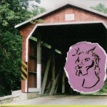
Diane Cluck is a super underrated American folk singer, and this cover again somehow captures the spirit of this record. Her ultra lo-fi home recordings are the exact opposite of rock n’ roll excess and so is the artwork. It just looks so peaceful in the countryside. I also like the fact there’s some weird hand-drawn dog head stuck on the cover for no apparent reason, it’s as random as the music. Oh, and this album is a dead set classic, totally recommended!

