Eli Murray of Gentleforce reviews his favourite album covers for issue 26 of Cyclic Defrost.
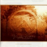
Aphex Twin – Selected Ambient Works Vol 2.
For me, this album is definitely one of Aphex Twin’ heaviest and most beautiful pieces of music. I bought this album whilst still at high school, after having recently discovered Volume 1. While Volume 1 was like the sound of ecstasy in a forest, Volume 2 was more terrifyingly sad but strangely comforting, like when you were a kid and you had a bad dream and woke up to find you were at a cousin’s house. The music has a real strong sense of isolation and feels like it was made on another planet. The sounds on it are just so otherworldly, cold and thick with haunted atmospheres. Apparently Richard (Aphex Twin) claims that he wrote a lot of the music after having very strong lucid dreams in his studio. Once he awoke, he would try to re-create the music he was making in his dream.
The cover features a photo of a rustic/faded looking Aphex Twin symbol. I’m assuming Richard designed it himself and I have always been intrigued with what the Aphex symbols meaning is. It looks like a key or symbol to unlocking some mythical civilisation. When listening to the album and staring at the cover, I use to imagine that this photo was taken thousands of years in the future, by someone or something. The intense brown and earthy colours in the photo seem to saturate themselves into the music and I find myself having synesthesia moments where I see intense browns when listening to certain songs. If you want to know what listening to music on Mars sounds like this is the closest you’ll get!

Jan Hammer – The First Seven Days
I discovered this album through my Dad when I was still only a child. I remember he put it on the record player and turned it up nice and loud, handing me the cover to look at while the music played. The opening notes of “Darkness/Earth In Search Of Sun’ totally freaked my mind out, I found it quite overwhelming to listen to at first. The music on the album is full of synthesizers and prog guitar workouts and Jan, who plays all the music himself, attempts to create a soundtrack to the first seven days of creation. The cover, by Milton Glaser, features a lovely abstract watercolour painting of the earth, sun and moon with images of plants, insects and a snake in the foreground. The art, although colourful, has a cold feeling to it as well as a sense of stillness. I use to imagine stepping into the painting when listening to the music. I would go on these little journeys, always wondering what was beyond the horizon. You don’t see art like this on record sleeves anymore, and that’s why this cover is so unique to me.
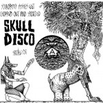
Skull Disco – Vol 6
In terms of sound and art, Skull Disco has to be one of the most original dubstep labels. Between 2005 and 2008, Shackleton and Appleblim released nine 12 inch records on the label, as well as an EP and 2 CD compilations. I first discovered their music through Kodama aka Scott Brown who had set up strong relationships with key members in the dubstep scene through his (now defunct) site Southern Steppa. Among them was Sam Shackleton. Sam used to send Scott promo in the mail and I remember being at Scott’s house and listening to his records whilst looking at the cover art. It was like nothing else! The music was deep, really deep. Full of cross cultural percussion samples, sub sonic bass drones and ritualistic vibes, this music pulled you in to a very specific sonic landscape. A landscape that was made up of dense jungles and barren deserts, that was full of dance, ritual and sacred gatherings.
Visually, the artwork was much the same. Zeke Clough’s artistic vision of what the music looked like was frighteningly spot-on. The illustrations had a real d.i.y. punk vibe to them (in the sense of black and white illustrations and hand made lettering) but with egyptian symbols and ancient ritualistic paintings included. I’ve read that Shackleton named the label Skull Disco after reading a book about a tribe in Cameroon that had dug up the remains of their ancestors so that they too could enjoy the festivities whilst the living members played music and danced. Its hard to pick a favourite cover when looking back on this label but Vol. 6 is a real standout to me. It was when both artists (Shackleton & Zeke) went up a level into a new dimension of creativity!

Boards Of Canada – Music Has The Right To Children
Good old Boards Of Canada. Over the years they have carved out their own unique sound and art design, from their detuned and hazy beats to their washed out imagery and simplistic font design. I bought Music Has The Right… several years ago after the cover jumped out at me in a record store. Over the years I have often picked up and bought music just because of it’s beautiful cover design. Sometimes an album will just be glowing in a store and the image will be beckoning me to pick it up and listen to it. It’s a magical experience, and something that doesn’t happen as often as it used to, as I don’t frequent record stores as much (note to self: continue to support independent record shops).
The first thing you notice with the cover image is the colour. Its saturated in that very distinct turquoise green/blue. This colour IS Boards of Canada. Just like Coca Cola has their trademark red, Boards have their turquoise thing going on. The faded image on the cover – of a family, maybe on holiday – will always stick in my mind. The imagery is just like Boards of Canada’ music: faded, nostalgic and magical. The adults and kids have their faces smudged out, and that’s a riddle that is unsolved, or maybe a key to some deeper meaning.
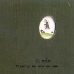
Mum – Finally We Are No One
Mum… what happened to them? They used to be great! I think after creating an album like Finally We Are No One there isn’t much a band can to do to improve on it. Also, Kria Brekkan, one of the key members, left the band and seemed to take the magic with her. Discovering this album was another instance of me walking into a record store and being impressed it’s cover art. The image of a book cover, worn and faded, is the first thing that strikes the eye. It instantly reminds me of books that I had read when I was a child. The cover makes you wonder what exists through the small torn hole. The kid-like image of a little rocket ship floating above a grassy hill can be seen. What is this rocket ship actually doing? Is it landing? Or, is it saying goodbye? I like to think that the ship contains the members of Mum, leaving earth for somewhere else. Somewhere quiet. The music on this album is so fragile and achingly beautiful. Sounds for a funeral or a picnic. To me this is definitely the Mum album everyone should own. Their last great album. Goodbye Mum.
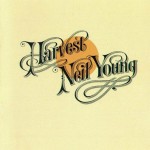
Neil Young – Harvest
Neil Young. You either love him or hate him. Many of the people that have been involved in his life actually hate him. I however, haven’t and am probably better off for it. I owe my Dad all the credit for introducing me to Neil’s music. This album is definitely not his greatest but it was one of the first images I can remember as a child. This album cover is a near-perfect example of hand written lettering from the golden era of music. The words have such a delicious flow to them and sit lovely over the top of a orange sun. The cover has a wash of cream over its entirety to give it that aged look. Even on the day this album was released it would have looked perfectly aged already. A timeless feel for a timeless artist.
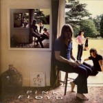
Pink Floyd – Ummagumma
Pink Floyd has probably been one of the strongest influences on my art and music. Visually all of their album covers have always been striking in colour and design. I dig the earlier album covers the most. Ummagumma is a double album: one disc is made up of live recordings from their shows, long pieces of psych rock exploration. The second disc is split into four sections with each band member recording solo parts. The music on this is really varied and there are moments of gold. The cover has a photo of all four members of the band, sitting and standing in various positions. On the wall there is a picture frame, which, if you look at it closely, features the same cover image, except the band members have switched positions. The image keeps repeating itself within the frame, a technique known as the Droste Effect.
I love everything about the photo on this cover. The physical words Pink Floyd being placed on the floor. The vinyl copy of the Gigi soundtrack leaning against the wall (a complete mystery). The faded colours and natural light being used. The dreaminess of it. Just like hanging out at your mate’ house, in the backyard on a Sunday afternoon. Oh, and a word of warning: its probably not a good idea to play Roger Waters’ song “Several Species of Small Furry Animals Gathered Together in a Cave and Grooving with a Pict’s at a social gathering… you might break someones mind in half.
Gentleforce’ Sacred Spaces is out now on Feral Media. See an interview with Gentleforce in this issue.


