Artist: James Brown vs. Little Willie John
Title: Soul Fever 1955-56
Label: Saga
Format: CD
Designer: Element-S
This compilation forms part of the All Star Series from London’ budget label Saga Records, with the likes of Edith Piaf, Ray Charles, Fred Astaire and Fats Domino alongside it in the series. Historically, Saga had a reputation for cheap and nasty sounding releases, mainly because their record pressings used scrap vinyl from the Phillips record pressing plant, enabling them to sell wax at such low prices. Thankfully in the wonderful digital age, this isn’ so and the budget prices now result from clever licensing and economies of scale — something that the packaging happily benefits from too.
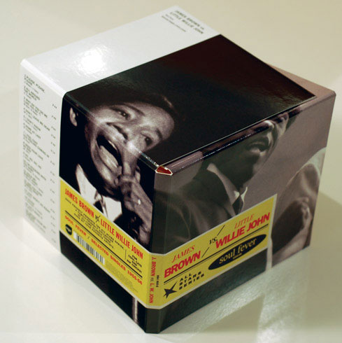
The great thing about a die-cut is that you pay only once, so if you do a run of 50 it’s pretty dear per unit, but for runs in the thousands, it’s barely noticeable. This sleeve is die-cut so that it folds out to look like a vintage gig poster, except rather than concert dates and details, it has the track information itemised. The outside of the packaging has a gloss finish on stiff, crisp, white artboard, and on the inside, only a varnish has been used to set the ink, giving it an authentic “60s feel. On the outside, a sticker for the album details has been simulated with a matte finish on top of the gloss of the sleeve photo. This would have been cheaper than actually applying a sticker, but is barely noticeable as being any different — plus it won’ deteriorate and get all dog-eared like a sticker would.
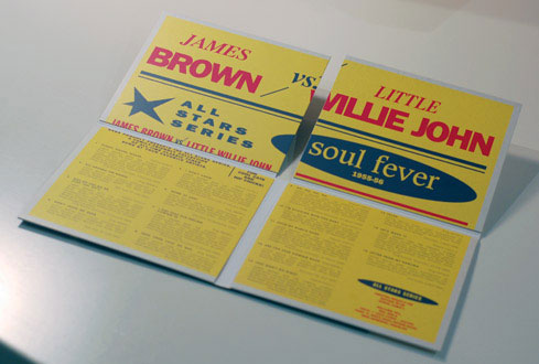
The cropping on a photo can really make or break a design and despite the photos of James Brown and Little Willy John being very different in quality, with vastly different lighting, they are cropped really effectively. When the CD is closed up, the two artists sit front and back of the package and you can only see them from their noses down — sing, sing, sing! When opened up, you cop the full shot of each of them and they are placed such that they almost look to interact with each other, having a jam.
The limited colour palette really makes the packaging punchy and gives it a credible time-stamp with black and white photography and then yellow, indigo and red inks used for the labelling. The choice of typefaces helps the vintage release look beautiful, although some of the kerning, (relative letter spacing), on the type is inconsistent and made my poor little eyeballs jump around like someone in grave need of an exorcism.
So if you have a decent run release, think of playing with the format of a die-cut to make it distinctive. To make a design punchier, limit the colour palette and consider high contrast imagery and of course, make a statement with your image cropping — sometimes what’s omitted is much more effective than showing the lot.
Artist: Various
Title: Harry Smith’ Anthology of American Folk Music, Volume Four
Label: Revenant
Format: CD
Designer: Susan Archie
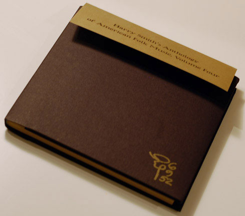
Beautifully crafted and immaculately detailed, this piece is an absolute adventure to experience. It is essentially a 96-page,exquisitely bound hardcover book with black CD pockets to hold the discs as the end papers.The CDs themselves seem the least thought out element, simply printed yellow on a white ink coverage — almost an afterthought to the sleeve and book design. The cover is thick, uncoated, black card with a “touch-me-more’ tactile quality. It has been simply printed with Harry’ handwritten monogram in the bottom right corner and the label logo on the back in gold ink — simple, elegant and so very classic.
The pages of the booklet are unbleached, tan, uncoated paper stock that has been printed only with black, gold and white inks. White ink is such a treat because it has such a divine opaque quality but also it seems crazy because it is at odds with the additive nature of the way we usually print ink. The images throughout the compendium are either duotone photographs, (black and white, gold and white or black and gold), or highly detailed metal plate etchings. As lovely as these are, they have more of a medieval feel rather than a folk aesthetic, which is strange although not entirely unpleasant.
The imagery has been handled in thoughtful and provocative ways. For example there’ a photo of Harry Smith pouring a glass of milk for himself and it’s a black and gold duotone except for the milk and reflections in his glasses, which have been overprinted in white. Another image of “Brain Drawings’ has been cropped so that the person’ head seemingly exudes the illustrative eruct.
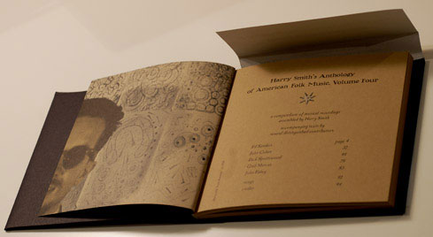
Oooh, the type is scrummy! In keeping with the printer-like feel of the uncoated, etched approach, the type all looks to be hand-cut from either wood or metal and set in the racks of old. (It hasn’ been but seems to have been which shows a level of care that makes you feel spoilt). Despite the arts and crafts approach, it is all incredibly readable and has a clear and helpful hierarchy of text design. The only thing that lets the typography down is a few rivers in the text here and there due to the forced justification of the body text, which is set in a reasonably narrow,two-column grid. Lovingly punctuated with quizzical dinkuses, effective ornamental borders and rules, the piece is distinctive, varied and definitely a collectible keepsake.
Artist: The Neurotransmitters
Title: Untitled EP
Label: Autumn Recordings
Format: CD
Designer: Gwendellyn&Sebastian.com
Mwah! This one is a great example of “keep-it-simple, stupid’ or the K.I.S.S. principle. This package uses the ever-popular digipack format but has been a bit more thought out in that it has an arch removed from the CD pocket to make it easier to remove and replace the plate. It never ceases to amaze me the number of packages that make getting the CD out a real trial, often resulting in damage to the disc. People are all thumbs, so provide a place to let the digits get a decent hold and much frustration can be avoided — plus you do want them to listen to your music, right? (Or don’ you…)
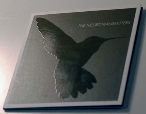
This is a sweet package that uses its two colours of olive and black effectively. I have to question the black colour choice though — yes we’re used to black type but that’s because it’s the default. If you are bothering to do a two-colour job, think about something different that will pop with the second colour. A rusty brown or bluish charcoal would have really made this design a bit more next level and would have helped the design elements advance rather than recede.
The cover has the band’ name reversed from the olive background in a light, italic, sans serif typeface. The band’ logo is a hummingbird silhouette and this has been treated as a simple spot UV and given that it’s really all about shape for this image, is a perfectly subtle and effective way to produce the form. The negative spaces around the image and type on each panel of the sleeve are generous and dynamic. I hope this was done to complement the fact that much of the music does the same. The idea of a design using the same approach or aesthetic as the music is hugely powerful for a sleeve design, as the two senses reinforce and support each other, heightening the awareness of that particular element.

The type on the inside cover of the sleeve is framed by 45 degree parallel lines. Given that the majority of the type is capitalised and italic, there’ a strange pull between the diagonal lines and the angled extenders of the actual type. I can’ help but be curious about how the overall dynamism could have been accentuated by changing the angle of the lines to either be parallel with either the extenders or the arms of the type.
Despite some potentially lost opportunities with respect to the colour and type, the package is quite lovely.
Artist: Various
Title: Swing for Modern Clubbing
Label: G-Swing
Format: CD
Designer: Unknown
This saucy little number really does a great job of being obviously of our time by reinterpreting art deco elements in a fresh and considered way. For those unfamiliar with G-Swing, this label was responsible for taking swinging jazz numbers and clubbifying them with jacking house and Baltimore beats in an infectious, fun and playful manner — I like to call it swing-core but I never managed to get anyone else to…
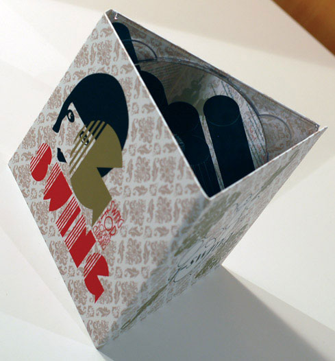
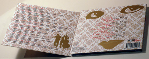
Printed in gold, black and red on white with a matte laminate finish, the background is patterned with a deco wallpaper style in a percentage of the gold ink, (which really needed to have a bit less ink-weight for some of the smaller type to be legible). A charismatic, flapper-style lady’ face peeks through the G-Swing grille of type, and her features frame the tracklisting on the back. This repetition of the same image adds impact, rather than appearing lazy, mainly because of the scale and extreme cropping of the back cover version.
The CD cover is a three-panel number that roll-folds closed. Here each song has its title in a red, faux deco font and then all of the details in black, modern sans serif type. There’ a solid silhouette of a double bass player and trumpet wailer as an ornament, which is quite sweet too.
A standout element is the way the graphic on the CD, (which is part of the G-Swing brand identity), interacts with the graphic on the panel behind the clear CD holder. It is basically an extension of the image, which is diagonal and has a great sense of movement. When the two graphics are aligned properly, (which is the first thing you want to do), it has brilliant visual impact, and the interaction of the graphic over the two spaces is so satisfying.
It would be hard to dislike this sleeve, simply because its character is such that it’s cheeky, chic and keeps you looking in case someone lifts up their skirt and you catch a flash of frilly fun.
(all photographs by David Cooper)
")
")
")