Each issue Cyclic Defrost examines some interesting and well-designed sleeve art.
Artist: Boy Brightlulb
Title: Is This a Desert?
Label: Independent
Format: CD
Designer: Josh Santospirito & Nadine Kessler
This album gives the privileged feeling of having just been handed someone’ flights of fancy in the form of a personal travel journal—a gift to thumb through at leisure. Sonically, you’re taken on adventures through memory saturated landscapes and shown quirky thumbnail sketches of people encountered along the way. Visually, the piece is somewhat clumsily handmade, scrawled and dog-eared, which is just how such a personal offering should be presented.
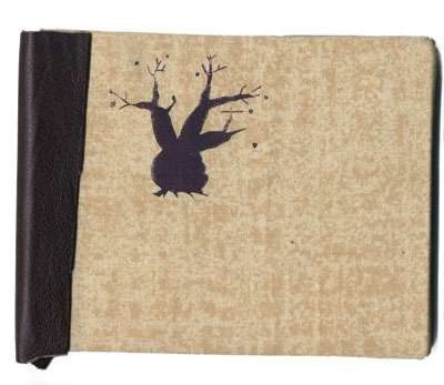
The cover is two thick pieces of board, the front piece being covered in course, mottled, tea-coloured fabric. It has been screen printed in brown with an image of a stylised Boab tree, sitting tubby and quenched in the top left third of the space. The Boab has also been stamped onto the CD, which is otherwise unadorned. The spine is wrapped in a hand-chopped piece of chocolate-y leather, which serves to hold the two boards together.
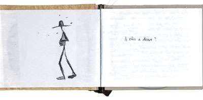
Inside, a roughly cut, 10pp, hand stitched booklet is pasted onto the boards to form the endpapers. The verso endpaper has a sketch of a ragged wanderer— with hands on the belly and flies on the brain. The recto one has a black strip of art paper pasted onto it, which is where the CD slips in. A similar styled sketch of a Boab resides opposite this.
The pages in between are the real beauty. A redolent soliloquy is scrawled across four pages in a hand given to curls and movement. This has been reproduced by photocopying, so there is the slightest level of noise added. The next two pages are the wittily written credits and track listing. For the finale Joshua signs off with the words, “Search for the colossal adjective.†The design of his cover shows he’ having a bloody good crack at this approach to life!
Artist: Various
Title: Pop Songs for Edith Metzger
Label: 4-4-2 Music
Format: CD
Designer: 4-4-2 Music
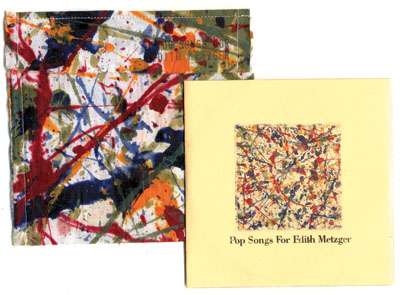
One night in August 1956, the action painter, Jackson Pollock, was drunkenly hooning home from a party in his silver Cadillac. With him in the car, screaming for him to slow down were his mistress, Ruth Kligman and her friend Edith Metzger. Nearing his Long Island home, Pollock wrestled with a bend and lost, being killed instantly as the car careered into a ditch and a tree. Ruth was badly injured, but Edith Metzger was also killed. Destined to be a footnote in a star’ story, this CD was compiled in remembrance of her, but also to acknowledge the many others who remain in the shadows of those deemed history-worthy.
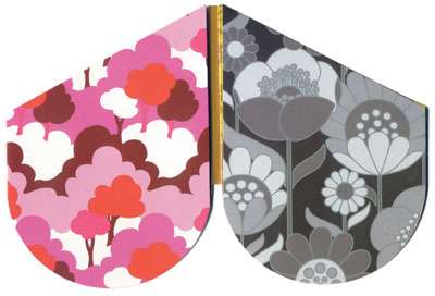
The outer packaging is a calico pocket which has been machine stitched and action painted in ruby, sapphire, emerald and topaz coloured fabric paint. Stamped onto the flap is the title and print number—a lovely approach to add to the overall inkiness. The packaging stands out due to the art-object nature of the piece and also serves to give a hefty hint that Edith was linked to Pollock. The really exciting thing about the painting is the sense of movement conveyed by the application of paint—quite a splash!
Inside is a manila pocket with the title and an inset image of the action painting from the outer pocket on the front. The tracklisting and album details are on the back. All of the type is set in the free Help Us Giambattista typeface, (a personal favourite of mine). The typesetting is obviously desktop published—large type, proportionally not enough leading and a bulleted list that is obviously done with heavy use of a space bar. It is a pity, as the type really makes the piece seem a little amateur, whereas the handmade beauty of the pocket is eye-catching and a delight. It would have been more effective to carry though the stamp approach to the type, or even do some hand lettering to continue with the unique object approach. Still, everyone who’ visited has noticed it on the bench, so they’re onto something wonderful!
Artist: Mordant Music
Title: Dead Air
Label: Mordant Music
Format: CD
Designer: Unknown
Dead Air churns and curdles disintegrated and forgotten broadcasts which spore amongst pulsating electronica, while Philip Elsmore eerily narrates anecdotes from his years as a presenter along with Mordant Music slogans. The concept behind this surprising juxtaposition of timbres is that there are superb creative possibilities arising from mutation and decay. The idea is carried through to the sleeve design, which utilises form, texture, and colour to convey this.
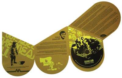
The most remarkable design element is the shape of the package and the way in which it unfolds. The deformed “d’ shape opens to give a mirrored reflection of itself and happily opens asymmetrically on each panel again—our first hint to the beauty of mutation. With the feel of a pop-up book gone wrong, its lateral approach allows the package to be slick and wonky at the same time, making it so very desirable.
A yellow, rusted concrete cancer texture wraps around the front and back covers, contrasting with the tight, punchy “d’ logo on the front. The second two panels are reminiscent of “60s wallpaper, the left in pink harmonies and the right in warm greys. At first I thought these out of place and to be mere ornament, but then the idea of archiving and the sense of fading joy that comes with consumer culture slipped into the periphery. Aha!
The internal panels are the weak point, with posterised images reminiscent of a “blah’ “90s club flyer and layout of the same ilk. At least the designer used the colours from the front with yellow mustard and black elements on these panels. The typeface chosen is a slab serif which looks modern and fresh without defaulting to a sans serif typeface and once again, adds to the concept in a fresh way, (it would have been so easy to have chosen a grunge typeface, especially given the cover texture). This sleeve demonstrates a thoughtful and fresh approach to a design that could have so easily been clichéd.
Artist: Automotive
Title: The Digil Parker Project
Label: Couchblip
Format: CD
Designer: Unknown
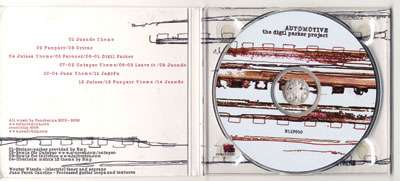
Much like the music it wraps, the yummiest way to experience The Digil Parker Project’s artwork is to let it wash over you, then zoom in. On a macro level, there’ beauty in the negative space, textural interaction and languid lines. On a micro level, noisy grit sparks from the environmental textures, which have been caressed by hand mark-making at some point in the graphic creation process.
Organic recordings of soprano sax, clarinet, bass and guitar swish and sputter against electronic sparks and manipulation in the newest offering from the Funcken brothers. Rather than “monkey see, monkey do,’ this is more a case of “monkey hear, monkey make’, as the sleeve design for the album echoes the approach to the music making process in its design methodology. Analog imagery has been augmented and ornamented with digital manipulation. Whether the original source for the graphics was scans, photography or scrawl, the post digital production result is something entirely unique.
Applause for using chocolate darkness and berry stained ink for the type instead of the black default… Claps too for the typeface choice, a faux old typewriter face, Fluoxetine, with smacked out degeneration—echoing the graphic fallout. The ragged, freeform layout of the tracklisting is indicative of the linear graphic forms, once again default deflection. Perhaps this could have been continued with the album detail information, (also perhaps the designers could get a credit!)
It’s cute that the Couchblip logo squirms from underneath the glue for the CD holder in the digipack. It’s also lovely that a lacquer rather than a celloglaze was chosen to protect, yet not reflect from the design.

 festival")
