Artist: Si Begg
Title: Jetlag and Tinnitus Part 1
Label: Noodles Recordings
Format: 12â€
Designer: Precursor
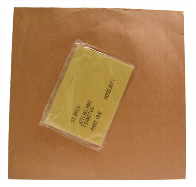
Nothing says “menace’ in these, our days of terror, quite like a brown paper parcel with a vacuum-sealed pouch. Anthrax paranoia aside, the contents are killer.
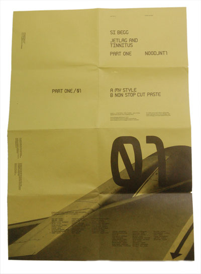
This thing’ designed. Simply. It would have been cheap to produce too. Ah, the beauty of good design! The record lives in a stock standard brown cardboard 12 inch cover, (a bulk order job). There’ a yellow bond A3 poster printed only with black ink, (a single ink on cheap, rough and ready stock). This is put into the vacuum sealed pouch and stuck to the front cover, (hell, the distro guys could have finished this part before they shipped them far and wide!)
When folded in the pouch, the poster just shows the record’ details in type that’s reminiscent of some computer generated form. Unfolded, negative space rules and slick typography and layout breathe in the space. A detail of an aeroplane fuselage shot as if from a passenger window swipes diagonally across the bottom corner, reminding you of travel stare scenarios. The computer blatt type is used stylistically to reinforce that this record is part one of a series but also add to the air travel look and feel.
Besides the digital form typeface, a clean gothic is used in a readable, but fine size. This is laid out in little blocks that are pleasingly but loosely arranged, alluding to scanner or office-use-only details. Without obviously referring to a remittance slip, the yellow paper sops up the process black ink to show you Begg’ experience of jetlag and tinnitus and allow you to relate on your own terms.
Artist: DJ Signify and Six Vicious
Title: No One Leaves
Label: Bully Records
Format: Double 7â€
Designer: Unknown
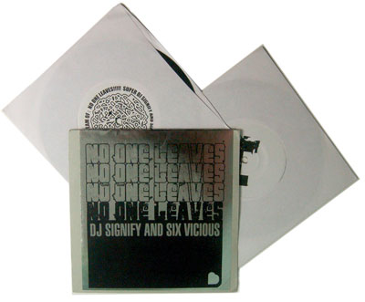
This little seven inch’ design is unique and attractive but in terms of usability, form flusters function! What does a record cover need to be able to do? Bare minimum? House the records and let you know the details of the recording.
Despite a pretty cool aesthetic, this sleeve sort of fails at either one or the other of these functions—you can read it or it can hold your wax. Ash coloured, linen textured card is folded in half and sealed with a massive silver sticker. The track names and recording’ information is all printed in black on the inside. Dying to know what the third track, which is a really killer ditty, is called? Slash! You’ve got to rip the sticker and from now on, you’ll need a plastic sleeve or a mending job of some description. Way to make sure you don’ get played on radio—is a back announcement worth a busted sleeve? Probably not…
Meanwhile, the silver sticker’ been screen printed in matte black ink and it looks sexy, shimmery and cool where the sliver shows through the porous parts of the paint. No One Leaves is echoed down the front in a distressed grunge font called FT Nihilist Philosophy and other than that, a clean, condensed sans-serif plays the typographic support role.
There’ something really appealing about the construction of this sleeve, the way it relies on the intrinsic beauty of the screen print and the peek-a-boo liner notes. Chances are, most people would happily pop the seven inch records on, and not concern themselves with the track names but rather enjoy the sticker mechanics. Trainspotters, however, beware!
Artist: Toxic Lipstick
Title: When the Doves Cry…
Label: Self Released
Format: CD
Designer: Toxic Lipstick
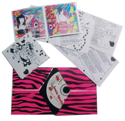
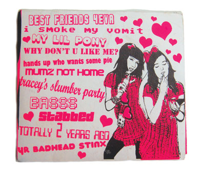
This sleeve has the perfect combination of pink and green—teen girl sassiness and the use of recycled materials. Black and fluoro pink inks have been screen printed onto off-white, textured card. These prints are used to wrap unused covers from Dual Plover albums, which provide the structure for the package. You can peel the black lining off to find Sro, Spazzmodics or Nora Keys CD covers underneath apparently!
The graphics are poppy and fun, with contrasty photocopy-esque illustrations of the wee, lippy ladies. The type is a cutesy foray into free display fonts, but is playful and hot in the pink. It really does pack a punch with its personality too. You sort of feel like you’ve stumbled on a pubescent’s diary—the love, the hate and the curiosity, (bodge tech quality and all!)
For an outfit whose lyrics are a big part of the appeal, making them into a zine with illustrations and freestyled layout is a damn fine way to get people to check them out. All the pictures are cartoons and are obviously heavily influenced by Japanese manga styles. They’re saucy and it’s easy to believe they’re a 14 year old girl’ doodles with works like “Poodle Cunt’, angry aliens and dishevelled geisha dolls. The CD itself sports hearts, ice cream and space invaders.
A little bit of care that was smile maker, was including a piece of black felt where the CD slides in to protect it. Way to care, guys! And CD scratching would have definitely been an issue, given the coarse card and roughness of the solid pigment laden ink used for the screen print.
It’s rude, crude but oh so quirky and is interesting to explore. So much care and thought has gone into it and the character pours out of the pulp. Sweet.
Artist: Various
Title: Various
Label: Feral Media
Format: CD
Designer: Sopp Collective
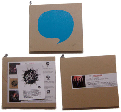
How smart. This small but important label has decided to invest in beautiful design and quality production that can be shared across and customised for various projects. What a fantastic way to get label recognition, make sure all of the packages are unique but linked to the body of work and economise by doing a larger production run.
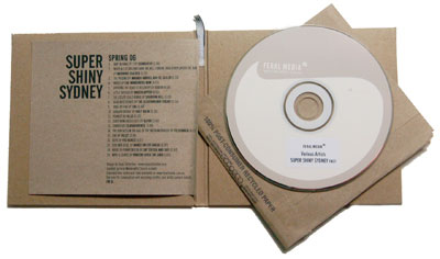
Great quality, brown recycled card is folded to a gatefold case. A “FM’ (Feral Media) label is sewn onto the top of the spine and the stitching and change of material adds to the textural approach to creating a plush package. This template can be screen printed, stamped, stickers added or any imaginable way of making a mark to give a unique visual for the project at hand. I hope they get adventurous playing with this element.
A condensed, gothic, sans-serif typeface is used for any text, simply printed in black onto brown recycled paper. This is just folded and slips into the left pocket of the gatefold for each release. Simple, effective and adaptable, this could be printed and inserted on demand quite easily, as the paper’ forgiving.
The CDs themselves are gently branded and then the specific release’ details applied as an unobtrusive sticker. The design is great because it empowers the label to be able to customise and create on demand slick, sexy and thoughtful packages. It is green-minded but still luxurious and speaks of a thoughtful and quality label—great communication!

