As the old adage goes, inspiration can be found in the strangest of places. For Alex Mustakov, cover designer for issue 30 of Cyclic Defrost, one source in particular is most unorthodox. “I know they’re cheesy but I really love animated GIFs,†he says, recounting the halcyon days of the World Wide Web with the sort of reverence that might ordinarily be reserved for great works of art. “I think they’re the most rewarding piece of art on the internet. I couldn’ give a toss about Flash and all that serious animation, I just love how crude and how silly it is. It’s cheap, it’s fast, it’s fun … you can actually be really nostalgic about those first things that made the internet really explode, or at least when we were first teenagers.â€
It’s not just the memories imbued in these animated pictures that tick Mustakov’ design boxes. Hand-drawn typography and the look and feel of photocopied, mechanically reproduced work comes through prominently too. “At the end of college, art and design tended to lean heavily toward a clean and clinical look,†he recalls. “Over time people are getting messier as they go along, in a good way. It’s a lot more creative and interesting. Typography is being celebrated again – people want it now. When I left college, no one cared. It was important to know how to do it well, but it wasn’ that much of a commodity. That’s probably where my head is at for this issue. I want to put actual hand work into it and make something that no one else has.â€
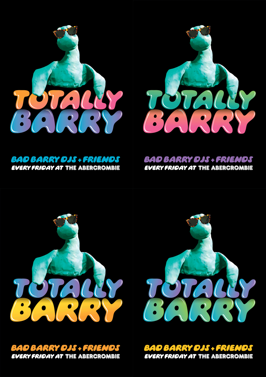
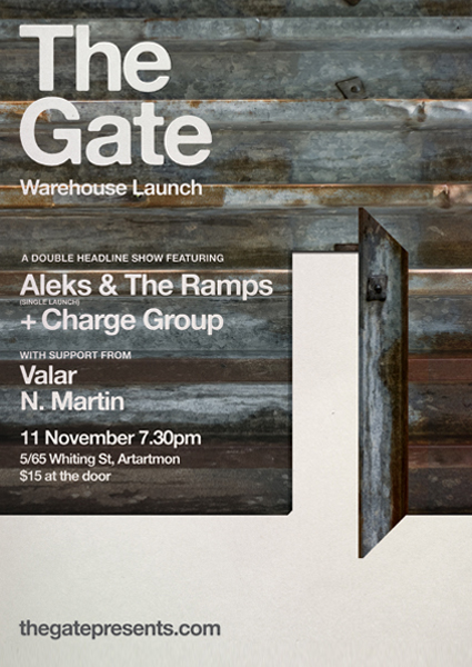
Mustakov is one half of Kitty & Rosevich, a creative duo co-founded with his wife and business partner Emma. Together they have been responsible for producing work for a range of clients and friends in the music industry like Totally Barry at The Abercrombie, The Gate series of live music events in the northern suburbs of Sydney, and several east-coast bands. It’s a diverse back-catalogue that also encompasses a clay Loch Ness Monster character called Barry, crafted by Emma. Incidentally, there’ also an animated GIF of him gracing their website.
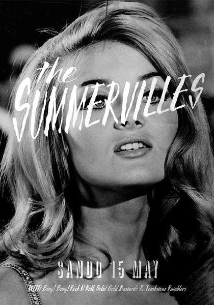
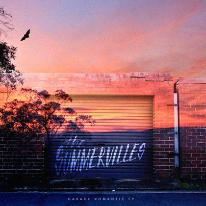
The pair seem to share a love affair with low-level reproductions, and it comes through distinctly in a range of Mustakov’ previous work – most notably in posters and promotional material for The Summervilles. There’ quintessential 50s and 60s iconography in the photos chosen, all artfully manicured hair and luxurious lips, which brings to mind a more innocent time. It was the band themselves who gave the direction for this particular look. “They never wanted to use any new imagery,†Mustakov explains. “The collaboration between us became a thing where everyone got involved and, I guess, making the EP art was like a fun working bee rather than a job.
“I get a bit of a nostalgia trip – with all the stuff we were looking for stills from movies or images from old magazines. Photocopied and doing stuff to them. I would love to own a photocopier. The first time I fucked around with that stuff was way back in college. We had a really good typography lecture, he was a bit of a fruitcake, but at the time he was one of those people who is really good at pushing your preconceived ways of doing a certain job. So we had this free brief where we had to produce this work, a reaction to some quote, something random and profound, but we had to do this typographic reproduction in any style you wanted. I ended up taking all these things; the main thing was I did all the reproduction by photocopying, blowing it up and distorting it. That’s where the love affair with low quality reproduction came from.â€
Last year Mustakov dedicated time away from his full-time creative day job to personal projects, which helped him realise that he wanted to spend less time on commercial freelance work and work more with musicians, writers and “… people I actually find genuinely interesting. They’re not big money clients but they are people I get behind what they are doing. I’d really work with them and hang out with them and do a bit of freelance agency stuff on the side because that pays the rent.â€
Many of those creative types are involved with PAN magazine, where Mustakov is Art Director. It’s a publication that links art, design, literature and music in a beautifully designed package, founded by Emma Dallas. “There’ a look in my head that the editor and I have,†he says, “we know exactly what it’s going to be like. It’s pretty straight how it currently is – A4 and glossy – but we’re going to do different things with it. We’re printing 100 plus pages, we might as well do something unusual with it.†The Holy Soul’ lead singer, Trent Marden, is involved in an editorial capacity.
Being one’ own boss presents as many challenges as it does freedoms, particularly for a designer. “I have to come up with something quickly that’s quirky or imaginative, but at the same time I don’ have to worry with someone saying “you have to put the terms and conditions here or we need a big URL on this’. Most people don’ actually care, they can use Google.â€
All the headway made during the previous year came to an abrupt halt with what Mustakov, almost affectionately, dubs the great hard drive crash of 2011. Even though he lost the majority of the build files for many projects, it was a reflective rather than regretful time. “I realised how much I had done and how much I was really enjoying it … for this issue I had some bits and pieces, some research, which I lost, but I’m thinking of going the typographic approach. The main thing I’ve been mucking around with in terms of finishes, that low level reproduction stuff. I like layers, texture, really basic things. Where I was kind of thinking the bits and pieces, stuff I want to scan, I kind of want to do something I guess quite contrasting and typographic.â€
On that typographic tip, there are plenty of reference points of contemporary designers who stoke the creative fires, like Sonny and Biddy of We Buy Your Kids, who were responsible for designing the cover for issue 22 of this magazine. “They are pretty much at the top of the game as far as artwork and working with musicians, arts events or whatever, I think they do a pretty stellar job. They have similar motifs – I remember looking at their work about four or five years ago, the Youth Group stuff … to me that was really unusual, I’d never seen anything like it.â€
Other local artists that inspire include Kindred Studio (Andrew Fairclough), Hana Shimada and Jeremyville, who gave Mustakov his first paid gig out of college. It was a t-shirt to promote TV-1′ Seinfeld marathon, a giant picture of Elaine Benes’ face with the phrase “Get Out’s plastered on it. Then there’ Jonathan Zawada, who has created work for musicians like Rustie and Canyons. “His stuff is even more different and crazy than what other designers and artists are doing,†Mustakov says. He also cites the neo-psychedelic works of UK designer Jiro Bevis as “amazingâ€, with his Lichtenstein-like raster effect incorporated on canvases bursting with cartoon imagery.
As for his own methodology, it’s all very much a custom build for each project. “I try to do things per purpose, I don’ really have things saved up. It’s from scratch every time. Whenever something comes in I like to look at things with fresh eyes and think what is the most appropriate, quirkiest, or right thing to do for this situation.
“So far I don’ really have a style of any kind, or not anything that I can really put a name to. Hopefully all the things are kind of tongue-in-cheek, funny or slightly unusual.â€
See more of Alex Mustakov’ work at http://cargocollective.com/kittyandrosevich

