Everything is changing. Shortly the United States – and by extension the world – will be presided over by an African-American president. At the same time an age of indomitable economic prosperity appears to have come to an end. It comes as a surprise to many, but these changes are affecting Australians. The world news section is threatening to enter our reality.
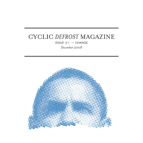
No less important is the change that has occurred here at Cyclic Defrost. Sydney designer Thommy Tran has taken the task of designing Cyclic Defrost, and to celebrate he has also designed the cover for this issue. You might have deduced already that the cover theme for this issue is change. It’s a theme that resonates with Tran at the moment, the man responsible for the increasingly iconic Popfrenzy logo, and most of that Sydney label’s graphic duties.
Despite being negatively affected by the dire economic times, Tran is quick to point out that some very positive changes have recently occurred, with recent changes in government in both Australia and the United States. It’s apparent in his design for this issue’s cover, which – despite recent negative impacts in his personal life (we’ll get to it later) – reflects the widely felt optimism regarding the regime change in the US, in spite of everything. “This at least give a sense that something is going right,” Thommy says.
Thommy Tran was born into a Malaysian refugee camp, before moving to Sydney two months later where his family settled in the inner west, where he has spent most his life. He studied a music based arts degree at Macquarie University, which is prescient considering much of his design work has been with music labels and publications.
It wasn’t until during his degree that Tran harboured the notion of getting into design. “I enjoyed reading magazines and was way into music when I was at uni,” Tran says of the change, “I saw Raygun, which was a music magazine based out of California designed by David Carson. It just made me think that anyone could do it. It broke all the rules of design and I liked that. It was abstract and creative. I saw that we had a chance to do that at uni in editing the uni magazine at the time. Then I discovered the perks that came with editing a magazine such as free CDs and door list spots to “review” gigs. It kinda worked out quite well.”
Tran has worked for a number of music orientated endeavours including a stint as chief editor for Passing Show magazine and assistant editor for Silverlimbo, as well as designing for Melbourne based promoting and touring company Penny Drop.

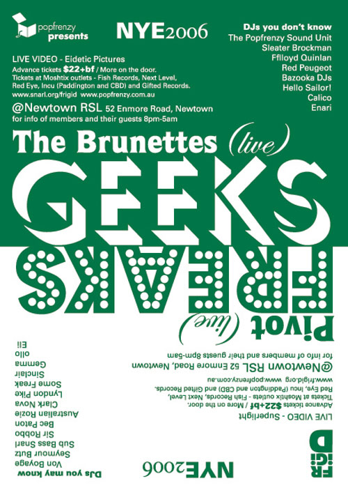
His most prolific output has been with Popfrenzy, where in addition to designing the label�s tour posters and some album sleeve designs he has acted as tour manager and helmed that label�s short-lived music magazine Moss.

“I met Chris Wu (owner and operator of Popfrenzy) back in 2002 when there were Popfrenzy nights at the Teachers Club on Mary St” Thommy says of his relationship with Popfrenzy, “It was great. super cheap drinks, great music and a good venue. A friend asked if we could DJ at a night and that was where the association began.”
For followers of independent music in Australia Popfrenzy’s visual design has become an immediately recognisable fixture in the local music scene, with that label’s jack-in-the-box logo gaining close to iconic status. Tran’s designs have always captured the youthful zeal and colourful dynamism inherent in the Popfrenzy roster, a label that promotes anything from the empowered dance floor thrust of The Gossip through to the shy, Flying Nun pop of Songs. Tran has consistently captured the indie-pop visual zeitgeist through careful application of pastel colours, boldly defined and spacious fonts, colour contrasts that convey a message and never stray close to overt busyness, and an eye for crisp, unobtrusive textures. When I ask Tran what the key principles are in his work, his short response is simply “Fun.”
“Usually what intrigues me are quirky things I see and hear. I like to play with design and make people interact with it. I like tactility. I try to design things away from immediate influences such as the city.”
“Good design makes you feel good.” He posits, “It makes you optimistic. I had always been interested in architecture and the arts, but more so as a consumer and observer. I would look at crap which was badly designed and thought I could do it better. Then when it came to me trying to make it better I realised how difficult it actually was. There lay the challenge I guess, I always wanted to make my own music, hence the degree. But it seemed design just took over. It’s worked out OK. I get to do both.”
“Change has directly affected my life,” Tran says of his theme, “I have recently been made redundant from my job. I would say that this is the first real financial event which has directly affected our generation as adults. The last major recession was in the 90s and we were just kids. This one has definitely affected us directly.
“I would usually read about these events in papers and think nothing of it,” He continues, “but this time around people I know including myself have been directly affected by this financial shift. I have become that story in the paper.”
Despite this, Tran is still celebrating change. When asked what the key motivating factor behind his design this issue was, he has just this to say.
“One word. Obama.”

 festival")
